Refrigerator
A band built from the combined efforts of immensely talented musicians, creating a sound that is always fresh, never frozen.
Tommy, the band’s guitarist and writer, is one of my oldest friends. Being able to contribute to his band’s visual identity made this project especially meaningful to me.
FREELANCE DESIGN PROJECT
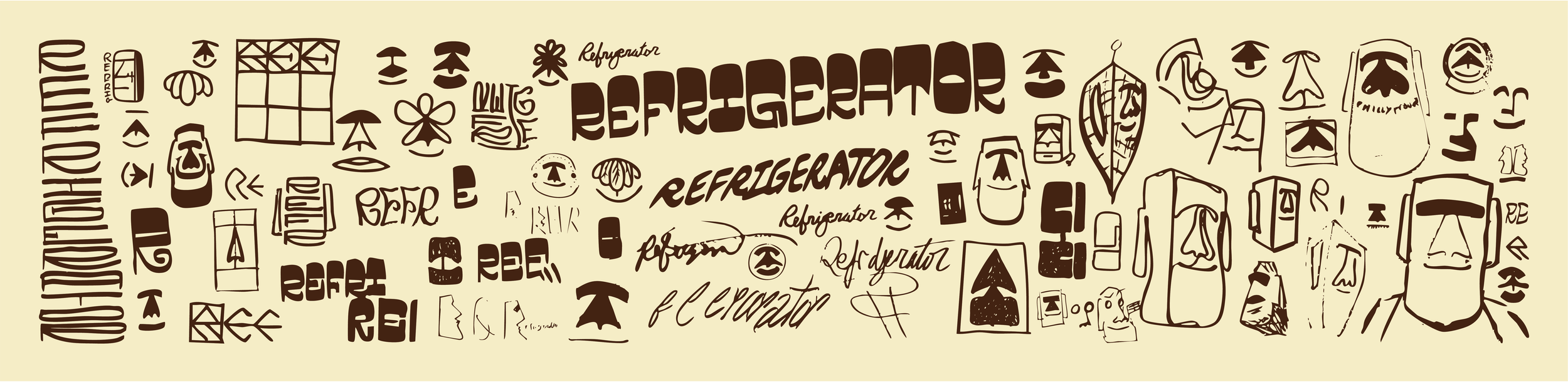
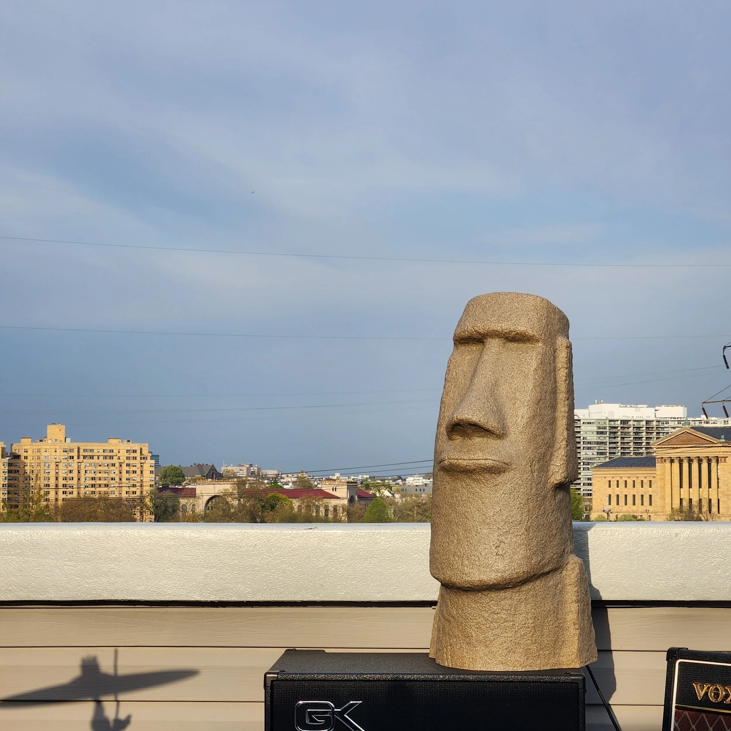
Using a thick Micron pen, I sketch through ideas as I explore type options and Moai forms, eventually landing on the logo and type
that feels right for the band.
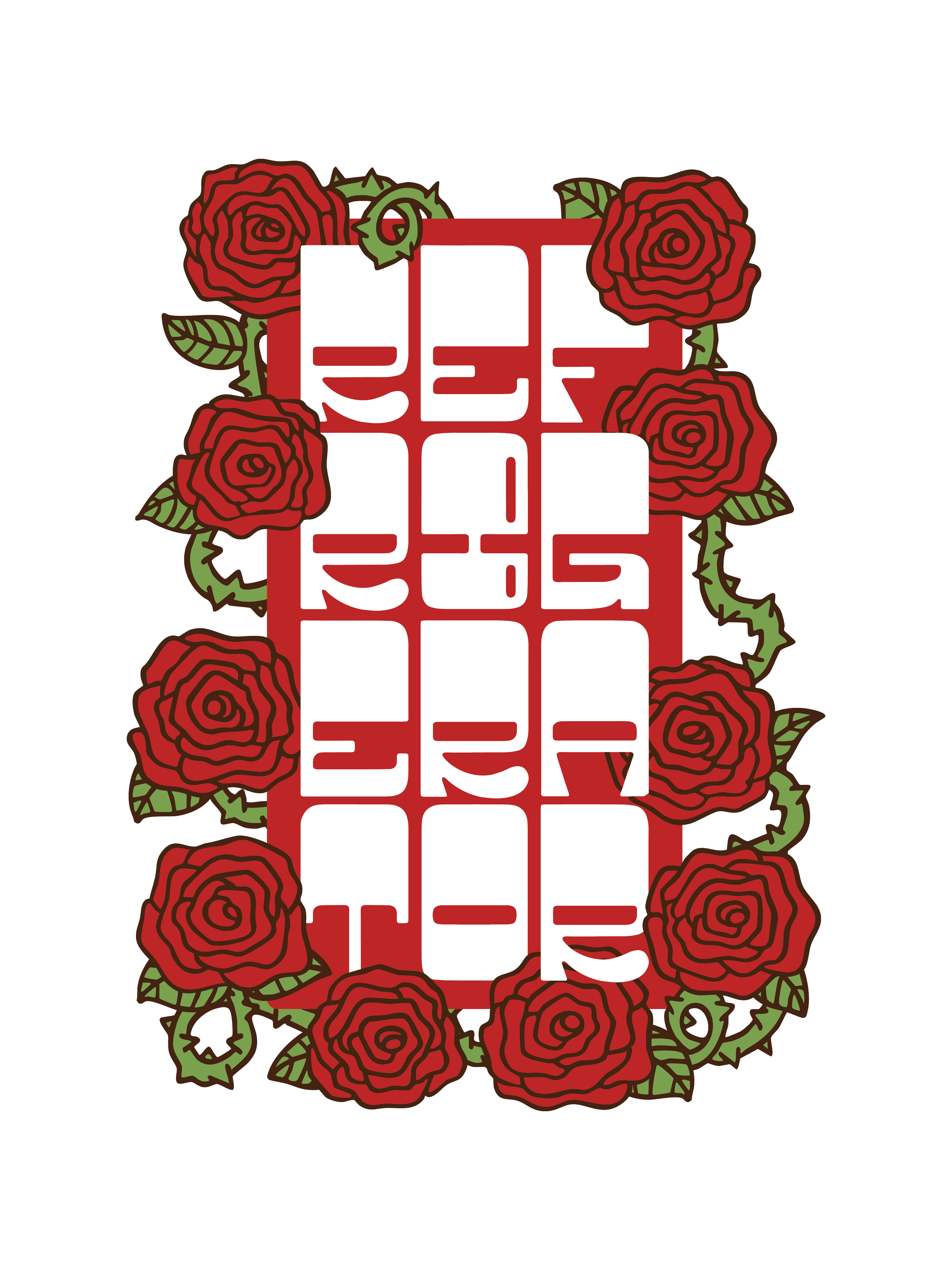
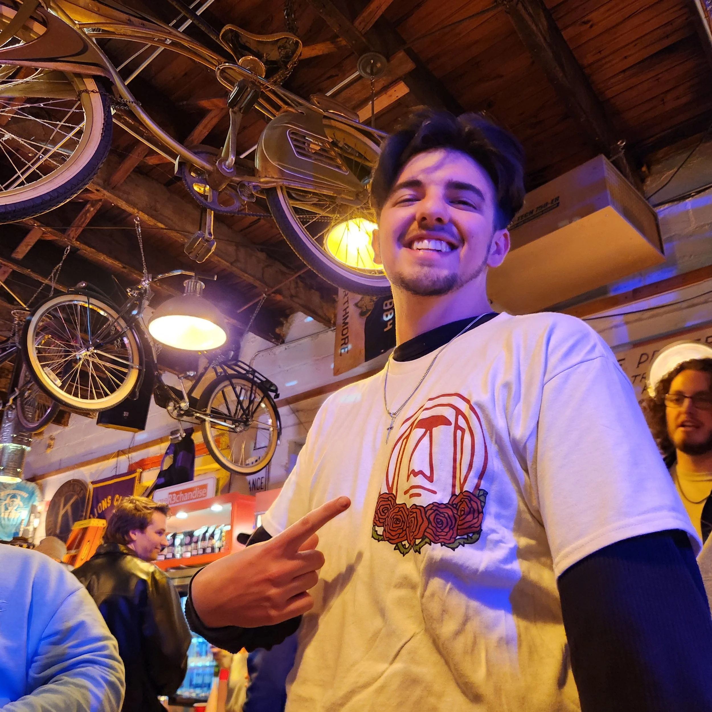
Refrigerator Band Mark
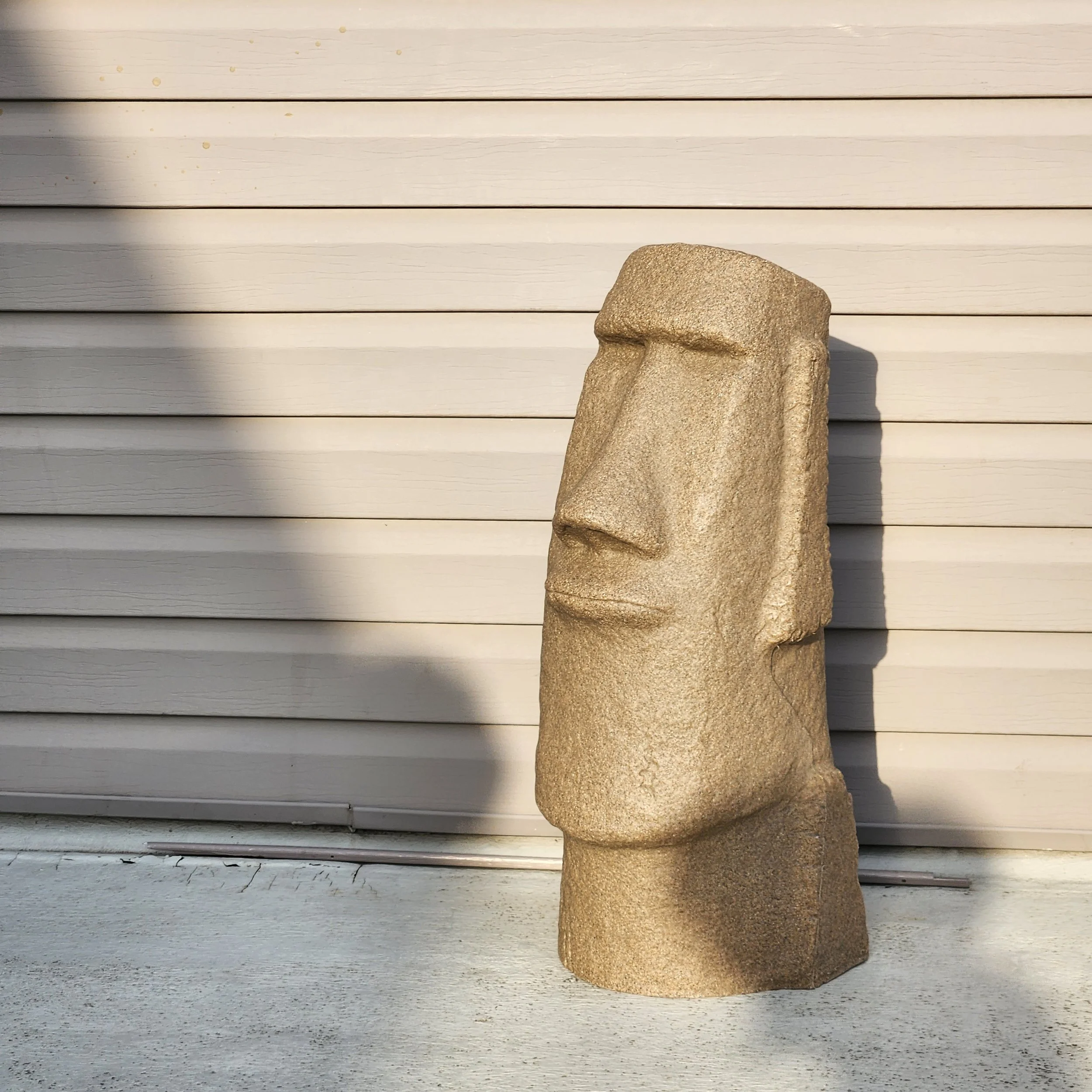
The Refrigerator logo is built around the band’s Moai head mascot, a prop they bring to shows that sits on stage, always visible to the crowd. I used the Moai as the central form and contained it within a circle so it translates cleanly across formats, from digital use to physical merchandise like stickers and apparel, where it also appears alongside illustrated roses.
The linework is clean but intentionally imperfect, with subtle waviness and roughened edges that soften the rigid structure. This gives the logo a more natural, laid-back feel, reflecting the band’s expressive, passionate sound.

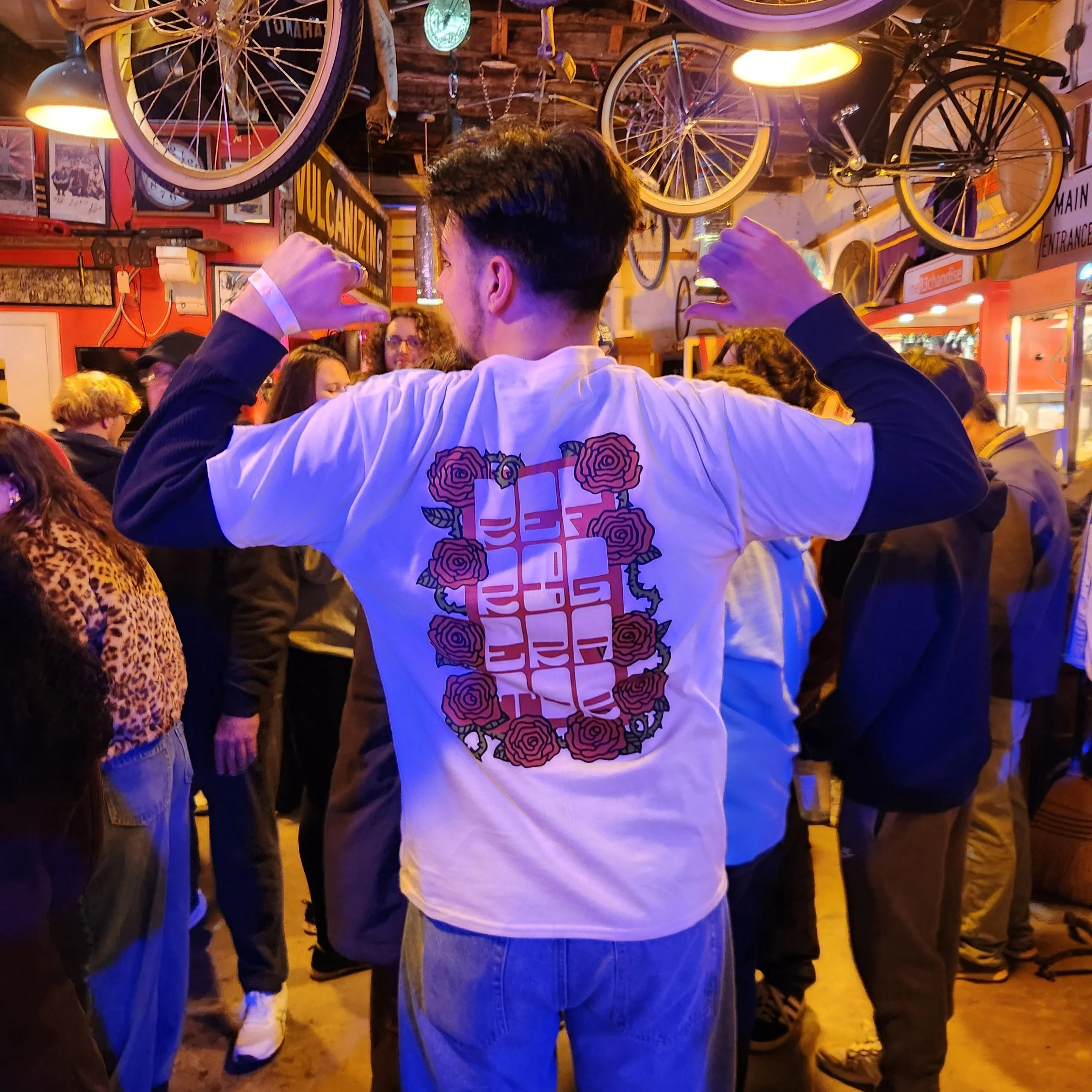
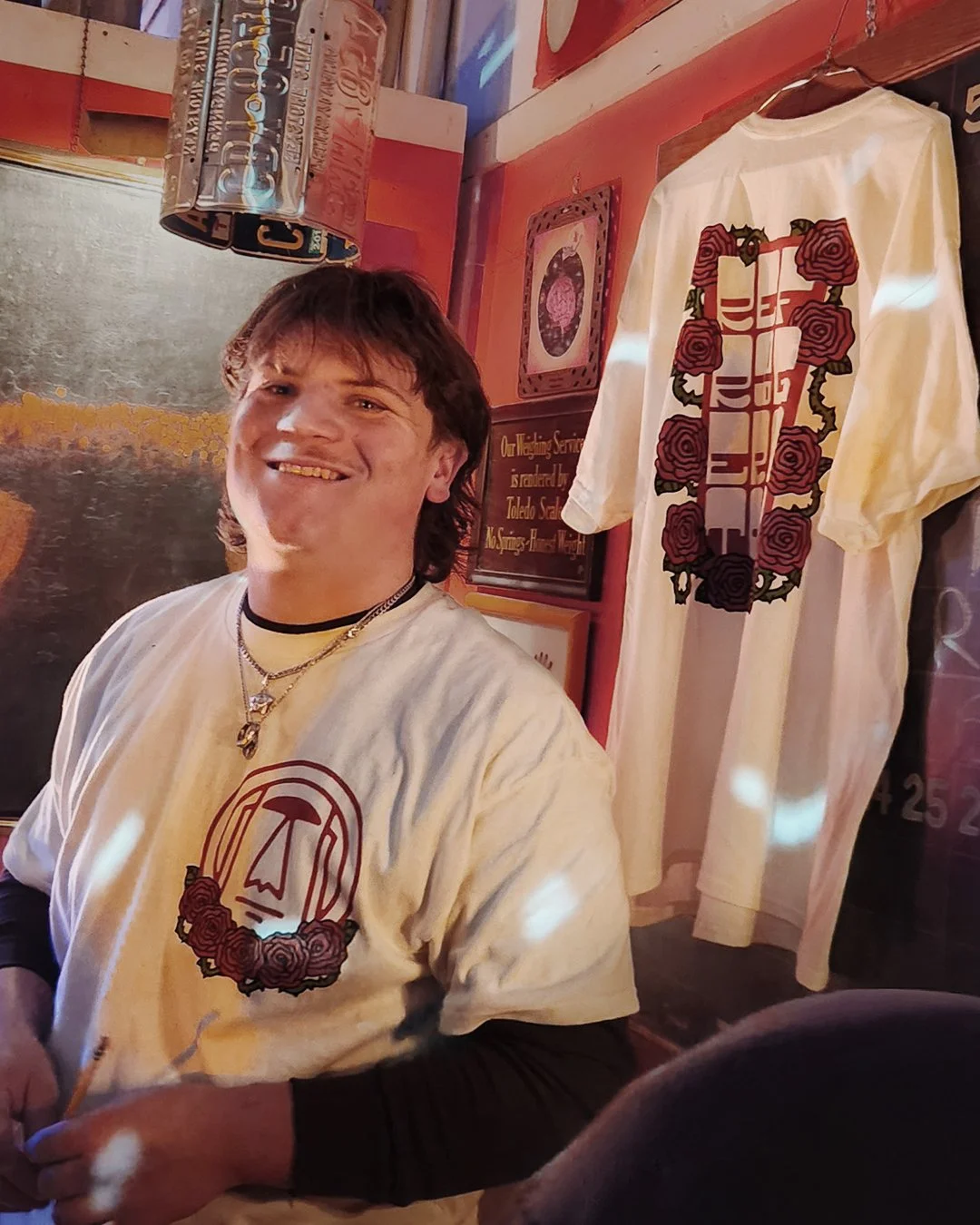
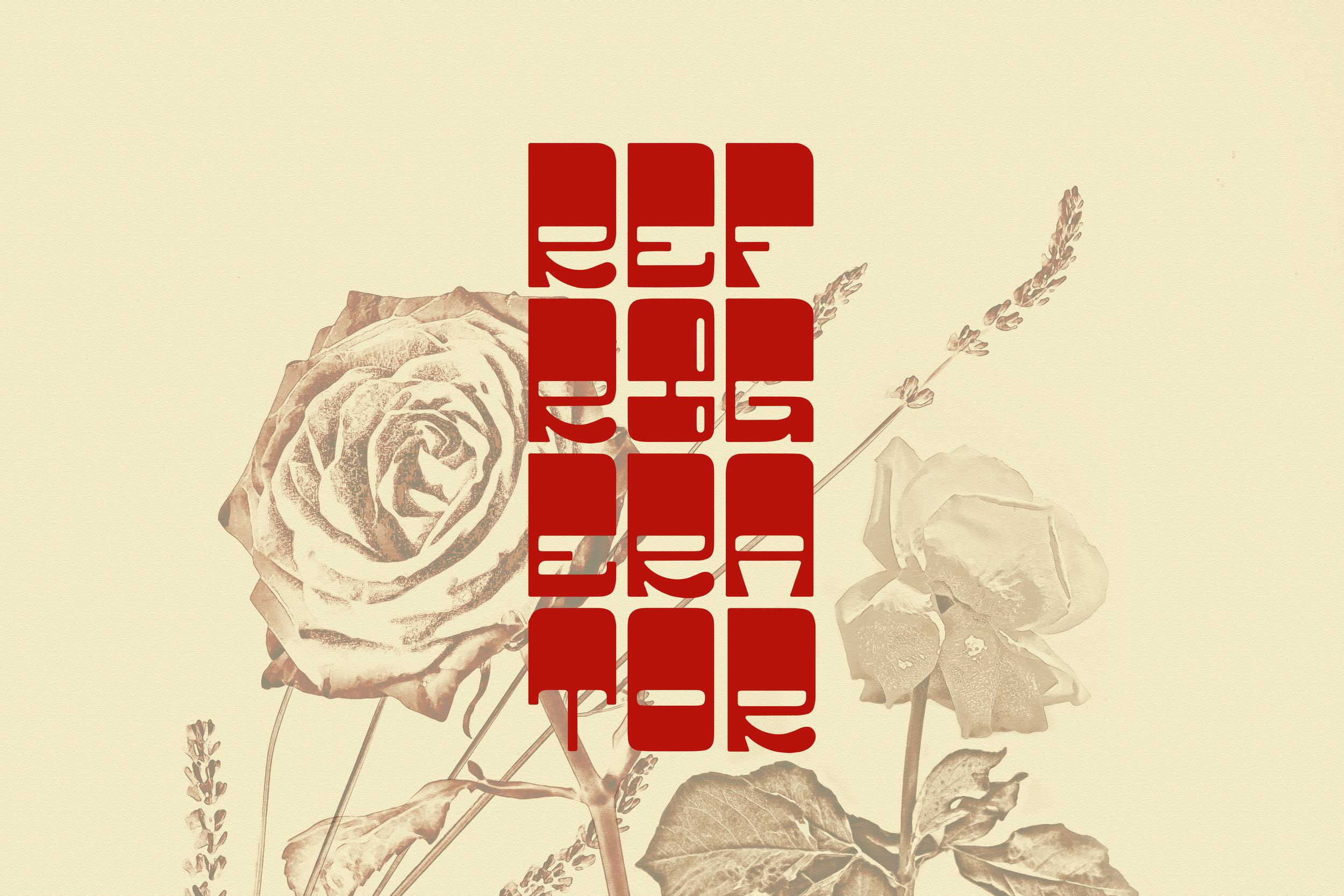
Shirt Design
The shirt design builds on the logo through hand-drawn illustration and custom typography. All roses and vines were illustrated by hand with a Micron pen, then refined in collaboration with the band to match their vision.
Using the selected forms, I developed the back design with my custom typeface, stacked to fit the vertical composition. The drawings were translated into vector in Adobe Illustrator, where I introduced dark brown linework and a complementary green to balance the brand’s red and tan palette.
The composition is structured yet natural, with roses and vines framing the typography and overlapping to create depth. The letterforms are knocked out, allowing the shirt’s tan fabric to show through, integrating the design into the material.